Process - UX Design Delivery for Agile Teams
A practical approach to creating assets and artifacts expected of a UX team on an Agile software engineering project.
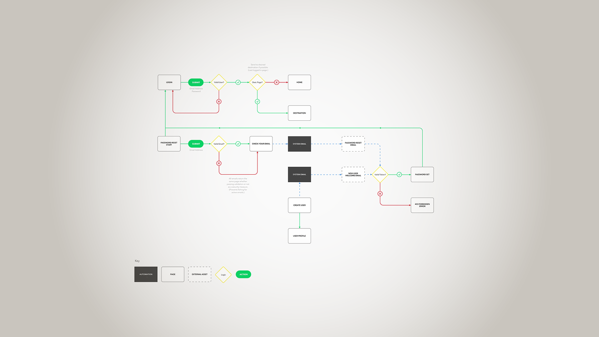
There are many fine articles floating around about fitting traditional UX design into an Agile mold. They tend to cover the principles well, but what I’ve found lacking is content that shows in a practical manner how to create the assets and artifacts often expected of a User Experience designer on an Agile development team. So let’s do that…
There are many assets and artifacts that can meet our definition, but I’m going to pick something very specific to keep the scope of this article manageable: a user flow for a software login feature. This entire user flow is what we want to build, eventually. But how do we get there?
Scrum software development works by building in a series of productivity sprints (usually 1–3 weeks). In any single sprint you set a small reasonable expectation for a feature that you can release to users at the end of a sprint and then execute. This is often referred to as a minimum viable product (MVP).
This means that for each sprint the UX Designer needs to define small, releasable, end-to-end user experience. This can be built upon in turn as the team continually releases the software and receives feedback.
So let’s actually define the MVP of our login system.
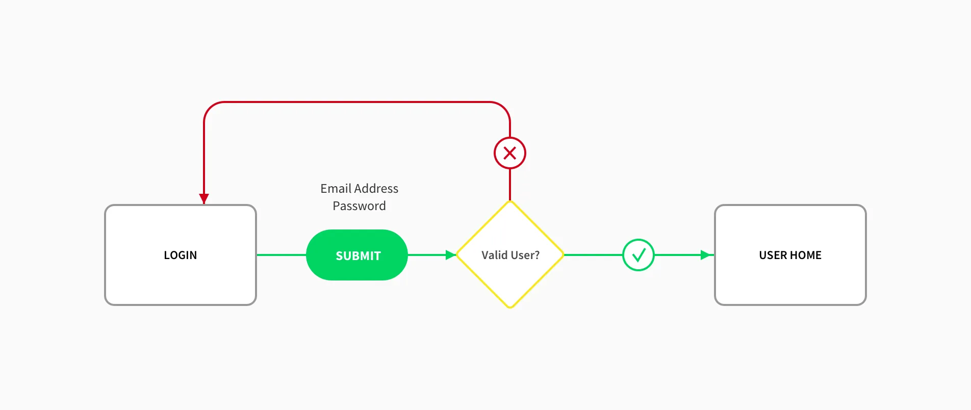
It has to keep some people out and let some people in. The minimum UX we could ship would be a form on a login page that validates user credentialsand redirects them somewhere OR reloads the page and shows them an error message.
There are features missing. We haven’t addressed creating a user or resetting a password, for instance. Early on in a product/feature life cycle we’re doing a lot of critical stuff manually, or not at all, but that’s expected. This is small; we can build it fast and show it to the stakeholders in our project. This will get us our first critical feedback.
Feedback on a login form!?
Absolutely.
This is where you’ll start getting feedback on your UI, the copywriting style, the responsiveness in terms of both speed and platform, the way the team works together, etc... It’s all going to be small potatoes, but that’s the point. What sort of team couldn’t handle potatoes this size?
When my dad taught me to shoot an arrow, he had me take my first shot standing THREE FEET from the target. Once I had drawn my bow, the only way to miss would be if it had spontaneously caught fire or I was hit by lightning (and even then I still might have hit the target just by releasing in preparation to run away screaming).
So I hit the target. And then I backed up a little, and I hit it again. And again. And again…
Small stuff is easy to define, easy to design, easy to build, easy to manage, and easy to ship. And the big stuff is made up entirely of small stuff. Once you get your team in this mindset, you can build almost anything.Prioritization becomes the hard part, not implementation.
So, what’s next? Manually resetting (and setting) passwords for our users isn’t going to scale very well. It will become a huge problem as soon as we achieve any sort of success with our product. What does the end-to-end version of that workflow look like to our users?
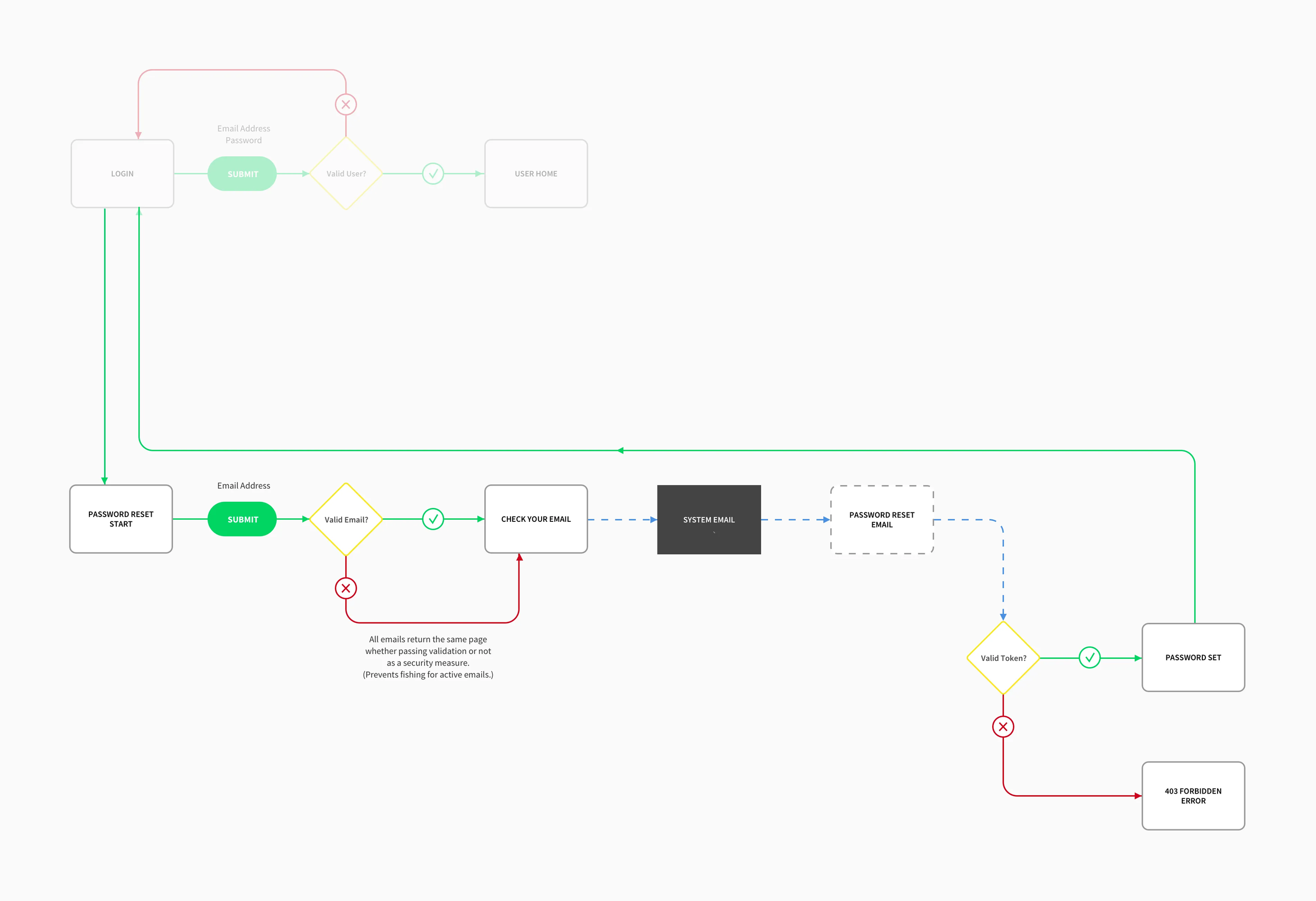
Now we’re talking. We’ve added several things here that make up a complete end-to-end password reset experience.
- We create a link from the login page to the password reset page.
- The reset page has a web form to submit an email.
- An email validator runs in the background. As a security measure, we’re not going to show any kind of error if they enter an email not associated with an account. We don’t want them fishing for live account emails.
- On submit they’re sent to a confirmation page saying to check their email for the reset link.
- If the email submitted validates, a system email module will send the “Reset your password” email.
- Clicking a link in the email leads to the landing page. It contains a password set form with a validator looking for the security token associated with the email address.
- We also start handling errors gracefully with a 403 error page.
Now, that is a lot more than our feature MVP. Depending on your team and your tech stack, more may still be small potatoes. If it isn’t, you can always break it down further. For instance you could build steps 1–4 above and have the email module send something to a developer telling them to manually reset it.
Most importantly we have v2 of our feature which gets us more feedback, so we’ll be better at building our thing during the next sprint. Don’t try to be perfect; it won’t happen. Try to be better. Better is small potatoes compared to perfect.
So now what? We’re handling accounts pretty decently once they’re created. Let’s automate creating the user accounts so we can quickly add new ones to our system without bothering the developers that are currently entering them in the database by hand.
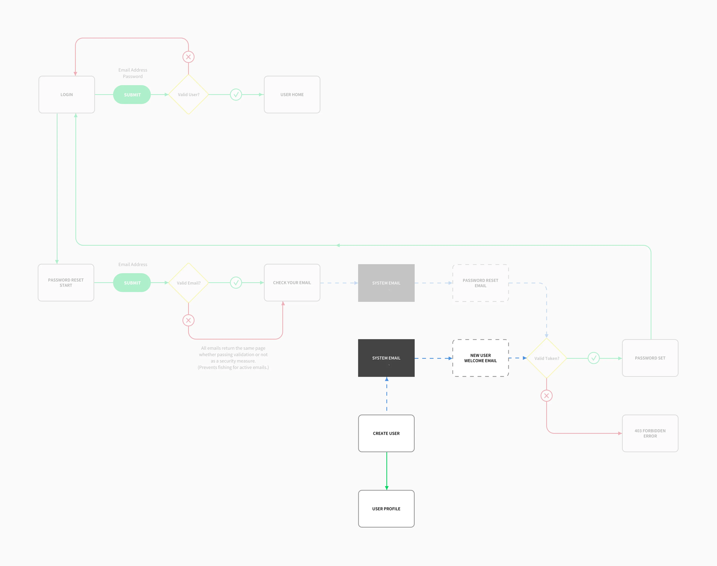
So what’s the end-to-end experience for the user?
- Creating a user.
- Viewing a new user profile.
- In the background, our email module built last sprint sends a welcome email to our new user with a “Set password” link. (Love using stuff we already built!)
- That link works with our existing (yay) “Set password” page.
- Once they set a password, use the existing (yay) redirect logic to take them to the login page.
Now we’re talking! This is great. Our software developers can stop hand-entering credentials into the database and focus more on features. Features that are nice to have. Such as what if someone has been in the system before and tries to go back to that page, but they’re logged out? Let’s redirect them to where they wanted to go after login.
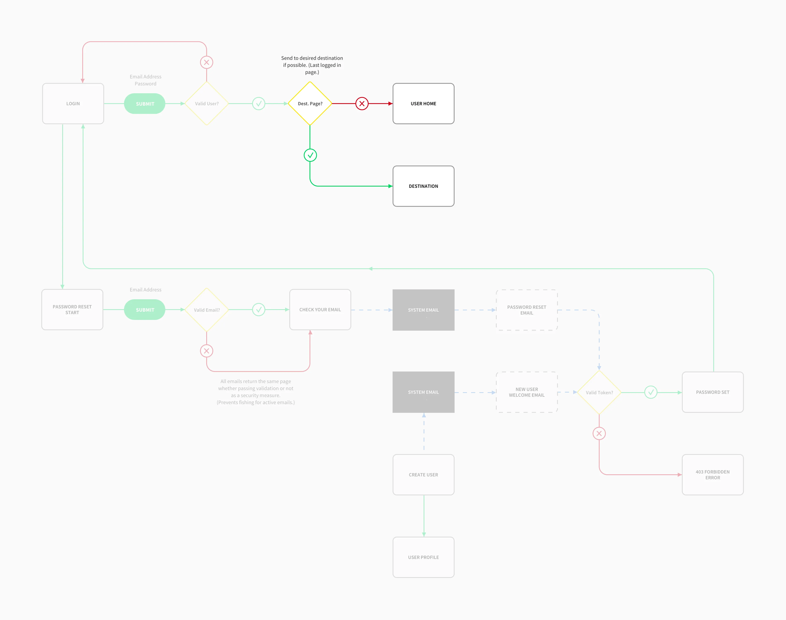
Release notes, “Users logging in will be redirected to their desired page.” Isn’t that nice? Now we’ve moved beyond needs and we’re knocking out wants. Fantastic. Go get your feedback and decide what to do next.
Now that we have some basic security in place…
- Maybe we want to add two-factor authentication to boost our security.
- Or social media login to increase sign up conversions.
- Or captcha to prevent spam, and so on…
Or maybe this is good enough for now and we start looking at other features. That’s the whole beauty of the Agile thing. You get to incorporate feedback and reassess your priorities often, so you never get trapped.
That’s a practical look at creating an application user flow on an Agile development team. A final note…
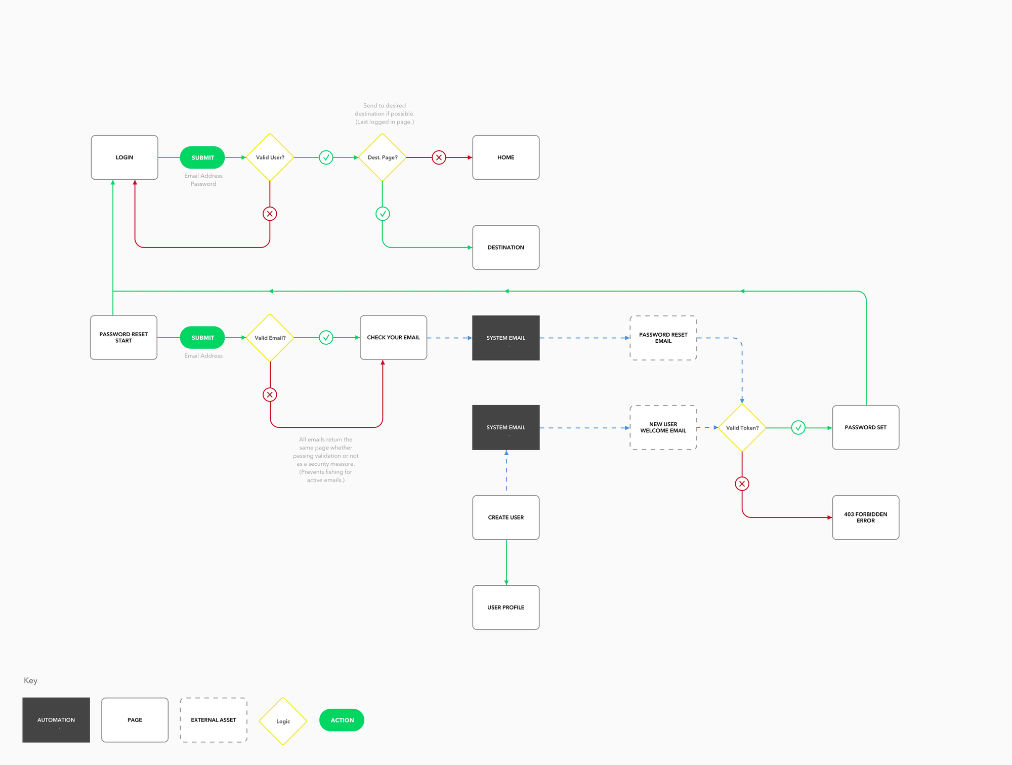
Just because you’re working in distinct end-to-end user experience chunks, you must not confine yourself to only thinking that way. For instance, I had planned the entire user flow at the top of this document before breaking it up into small digestible chunks. The danger is that the further out you plan, the more risk you’re taking that feedback will change your direction and you’ll have to rework your plans.
The amount of planning ahead you can get away with before the risk builds up too much and renders your planning inefficient depends entirely on context. It could be a single sprint, or it could be months. The more comfortable you are with your team and the more knowledgeable you are about your product and market, the further out you’ll be able to plan your user experiences effectively before breaking them down.
Lastly: the tools don’t matter much to the process. But I used the Mac OS Sketch App to build this particular wireframe. And I started with this free user flow template for Sketch that I found on Dribbble.
This piece was last updated October, 2024. It was originally published by Wade Meredith on Medium in October, 2017.
