UX Design - Fireworks CRM
Building a B2B SaaS CRM product for the higher education market.
Summary
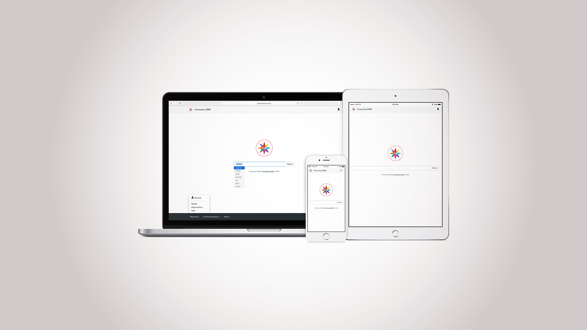
After having worked in design, engineering, and marketing roles at an integrated marketing agency for six years, I was looking to specialize. In 2013, I moved into an Interaction Designer role at Fire Engine RED–a higher education marketing services company. They were taking an "internal startup" approach to building a new software product–a contact relationship management (CRM) system for the higher education market with a business to business (B2B) software as a service (SaaS) business model. This product was Fireworks CRM (or just "Fireworks".)
I worked there for six years, moving my way up to User Experience Lead and eventually Director of User Experience. The product launched shortly after my third year at the company. While we gathered customer feedback and continued building features and support, year-over-year user growth was over 300% for three years in a row. I left the company in 2019. On December 14th, 2023, Fire Engine RED was acquired by Carnegie.
Situation
A marketing services company serving the higher education sector—Fire Engine RED—was experiencing growth in demand for more personalized, data-driven solutions for colleges and universities managing student recruitment, communication, and engagement. Fire Engine RED offered consultancy and other outsourced recruiting and marketing services to higher education institutions. As the landscape shifted toward more personalized marketing solutions, Fire Engine RED saw an opportunity for a CRM tool tailored specifically for this audience.
Fire Engine RED decided to create an internal startup team and build its software product: Fireworks CRM, or "Fireworks" for short. The Fireworks vision was a SaaS-based CRM platform that helps higher education marketing teams offer a user-friendly, consumer-product-like experience. Salesforce was already in the market but was an expensive, complex solution with no specific tailoring to the needs of higher education clients. Fireworks CRM's goal was to manage leads better, automate communication, track student journeys, and analyze engagement metrics. The product would need to be intuitive, accessible, and aligned to both the sector's specific needs and the company's existing service offerings.
Fire Engine RED had already developed quite a bit of internal tooling and used some of that knowledge to set up an 'internal startup' team. This team was tasked with the design and launch of an MVP (Minimum Viable Product) for the CRM platform.
Task
The core objectives for the Fireworks launch project were:
- Develop a simple-to-use yet robust SaaS CRM platform to manage leads, execute communications (text and email), and track engagement for higher education institutions.
- Design the user experience (UX) to be intuitive and easy to navigate for non-technical marketing professionals at universities.
- Ensure WCAG accessibility standards compliance to guarantee inclusivity for users of all abilities.
- Release a functional MVP within twelve months to validate the product concept, acquire early users, and refine the platform based on feedback.
Action
When Fire Engine RED's leadership recruited me, they were more than nine months into a waterfall development process with little to show. After working under these conditions for six months, I met with the Principal Software Architect, Product Manager, and Project Manager and built a coalition advocating for change. We developed a process change proposal for moving the team to Agile development and got approval from the VP of Product, VP of Sales, and CEO.
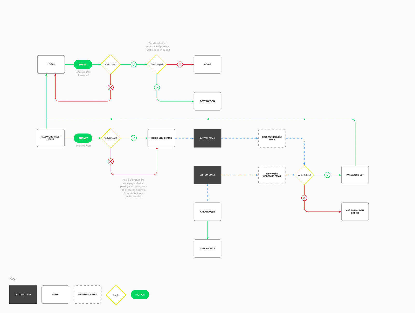
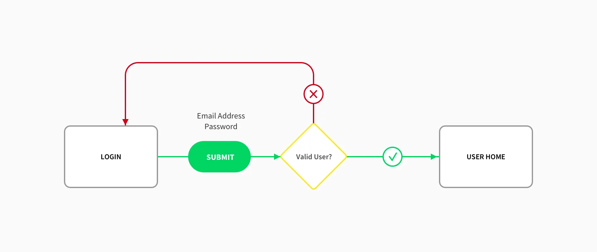
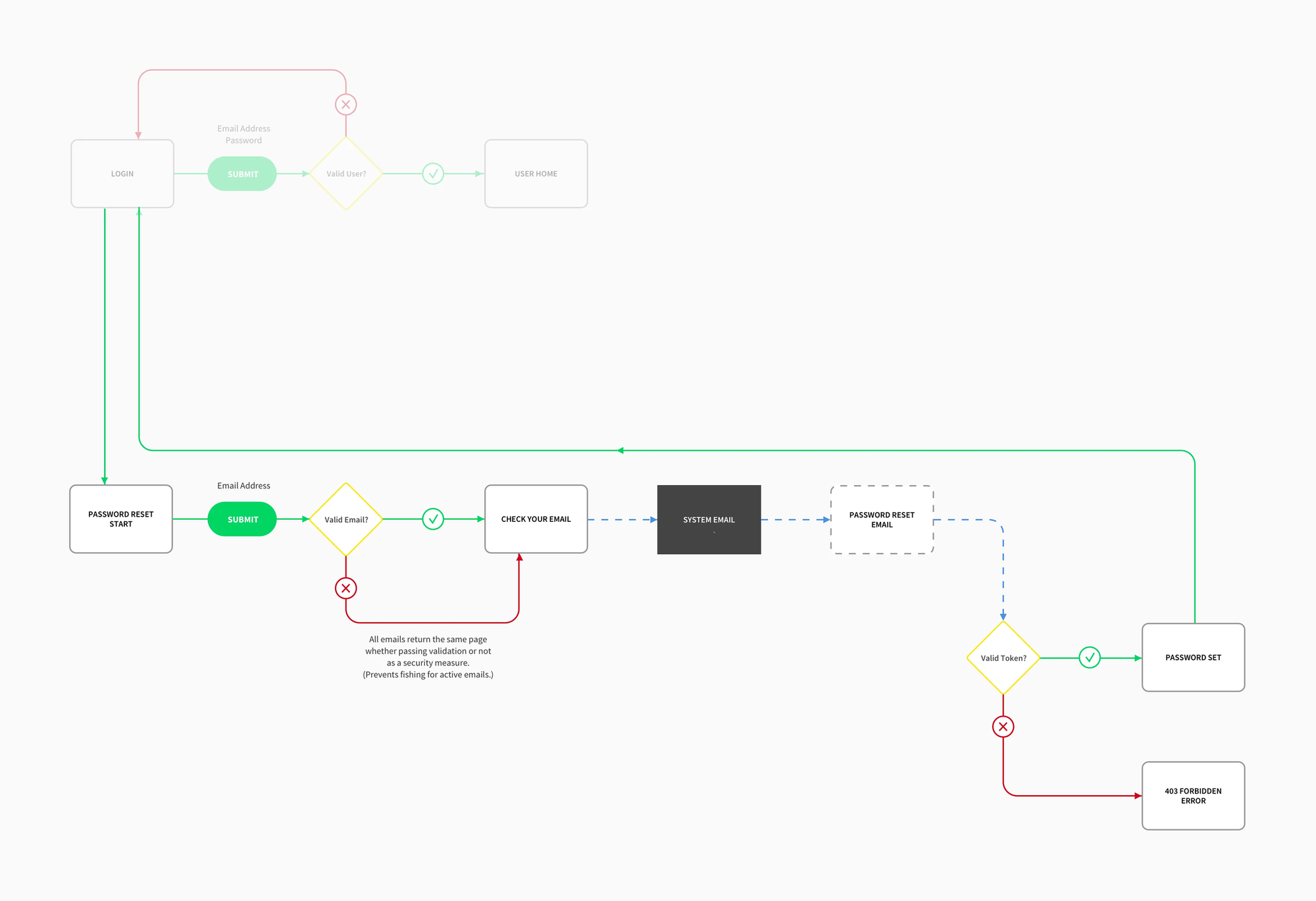
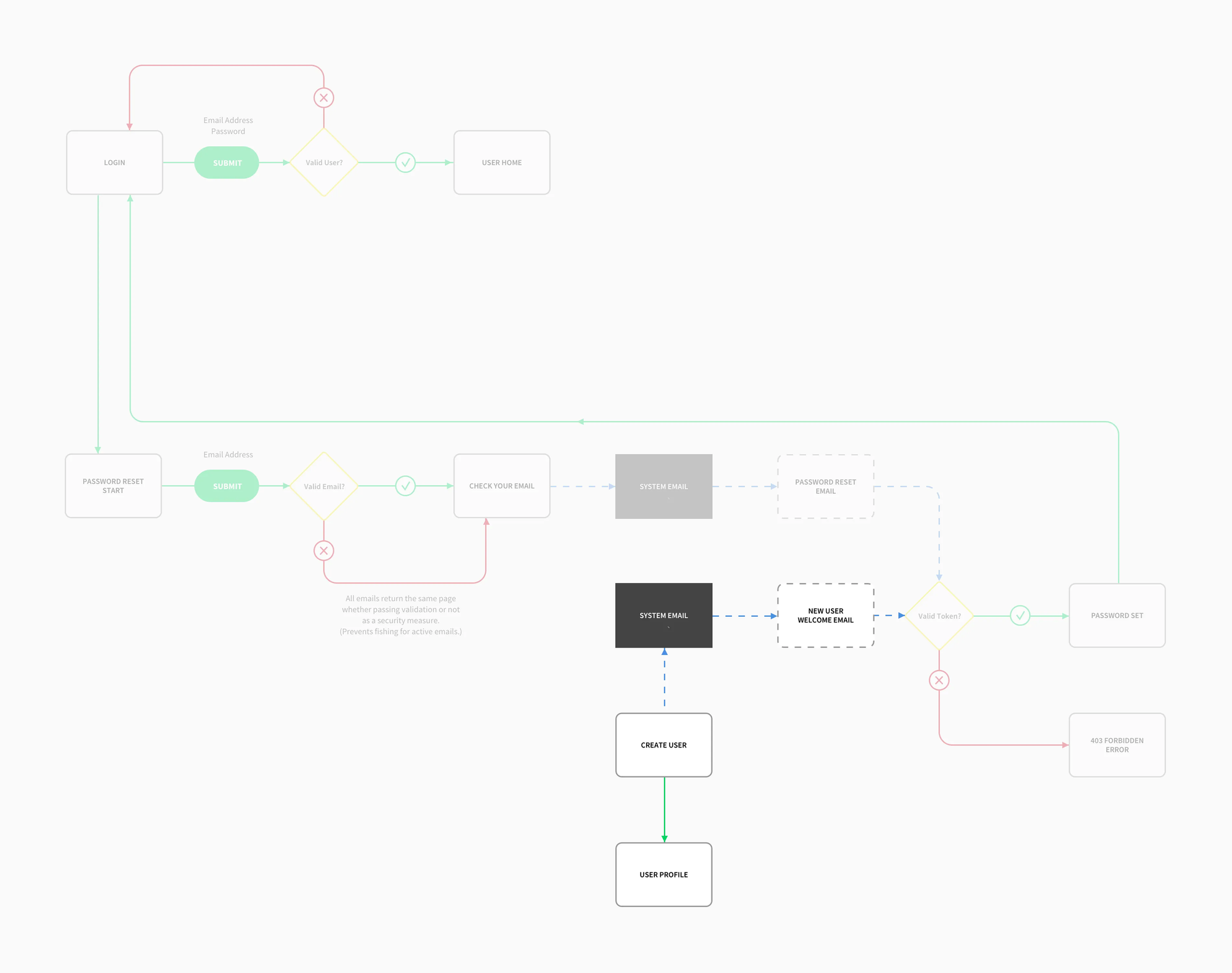
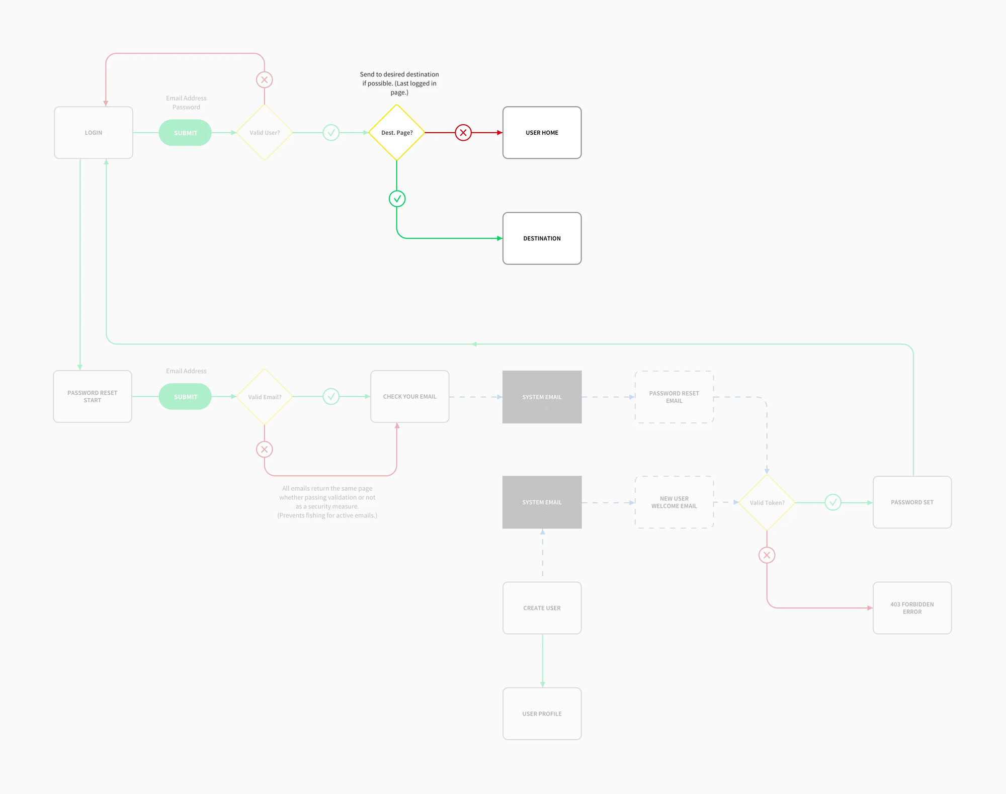
User Flow Planning for SaaS Authentication System
We applied our process change plan over the course of a couple months. See this article I wrote about UX Design teams working in agile frameworks. Fire Engine RED's development team demonstrated remarkable adaptability in embracing Agile development principles following a two-week sprint cycle.
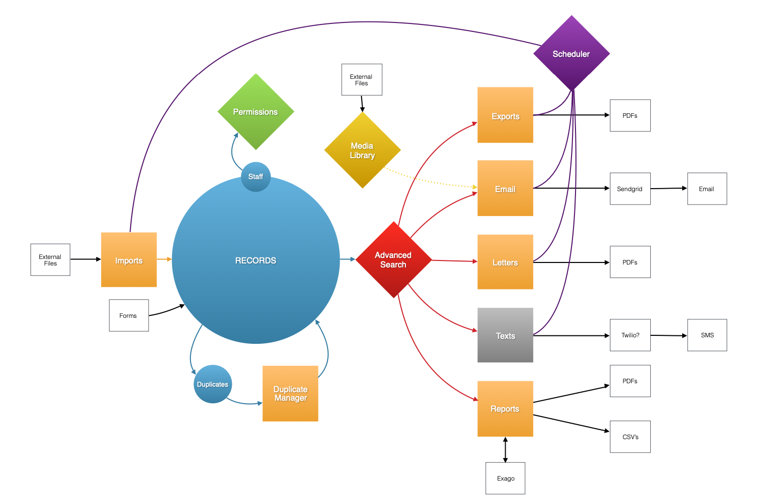
Planning & Backlog Creation
The team identified critical features for the MVP, which included robust authentication and permissions management, demographic segmentation, automated email campaigns, and basic reporting functionality. I worked with the product owner, engineering manager, and project manager to prioritize these based on customer needs, market demand, and team bandwidth.
User Stories & Feedback
As part of the product backlog, user stories ensured the platform met specific pain points of marketing teams in higher education institutions. User research, including surveys and interviews with seasoned university marketing professionals formed a solid foundation for design and functionality.
My UX team followed a user-centered design process that emphasized usability and accessibility. Throughout the development cycle, we focused heavily on feedback from potential end users.
User Research and Persona Development
- Interview university marketing teams, including admissions officers and digital campaign managers, to understand their challenges with existing CRM solutions. With Fire Engine RED's existing client base, accessing these user groups was easy.
- Develop user personas using our research.
- Key pain points included managing complex data imports and exports, lack of data insights on student engagement, and convoluted user interfaces that impeded productivity.
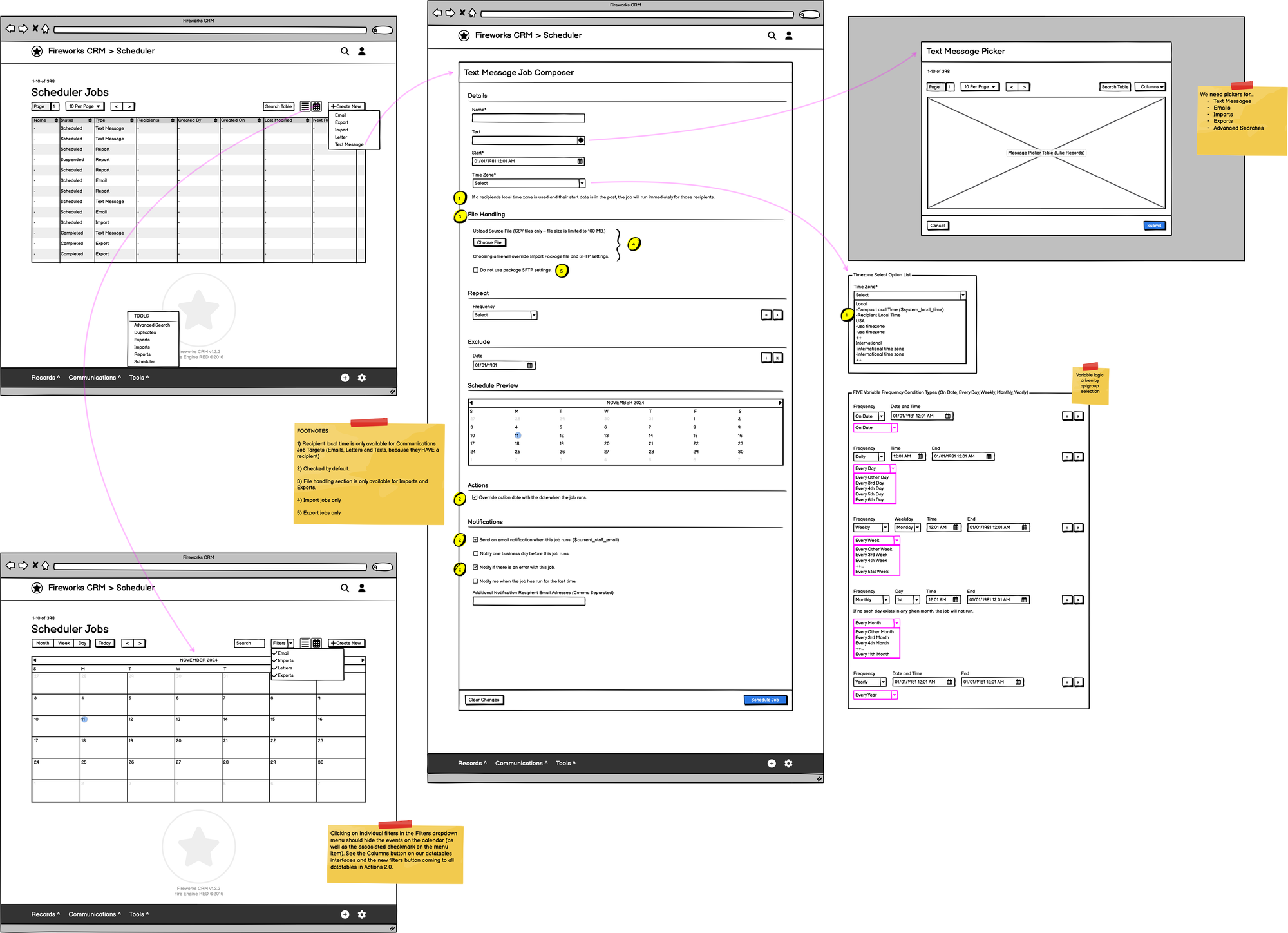
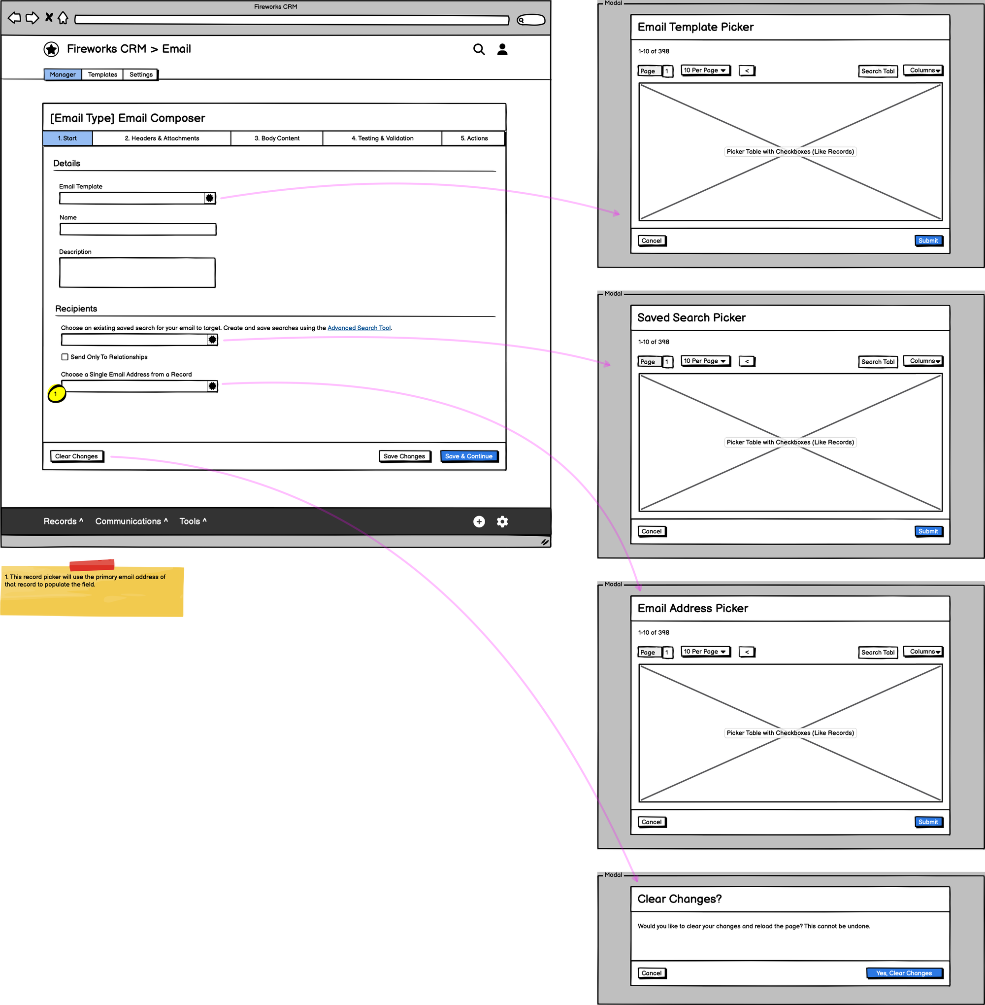
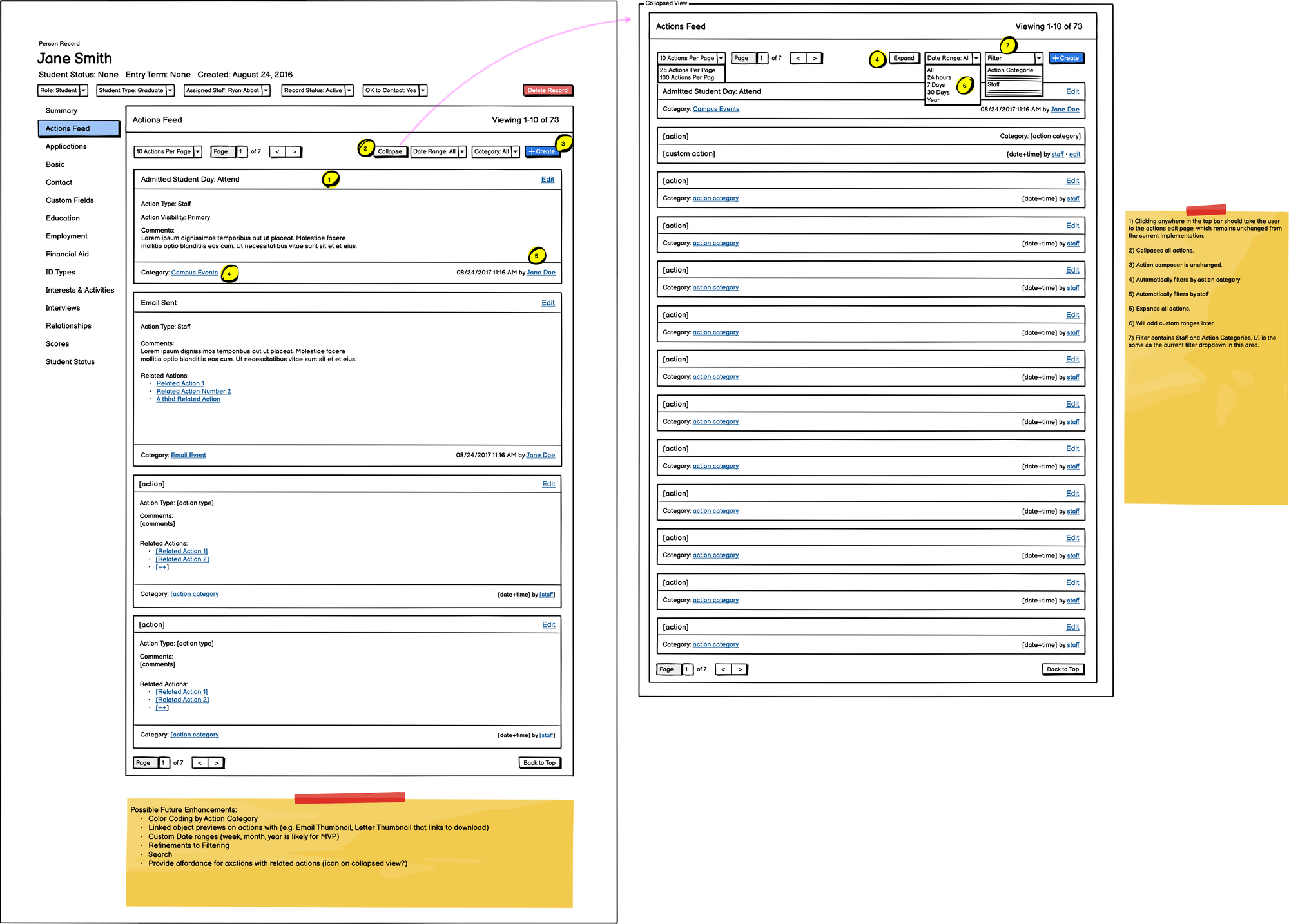
Wireframe Examples
Wireframing
- Based on user feedback, the design team created low-fidelity wireframes and early-stage prototypes. They focused on making key actions and interfaces simple and streamlined, ensuring users could navigate the system with minimal clicks.
- Usability testing was conducted on prototypes, gathering feedback on user flows, interface elements, and system design metaphors allowing users to move between Fireworks modules with ease.
WCAG Accessibility Standards
The team adhered to WCAG 2.1 AA guidelines throughout the design and development process. Key featured included:
- High contrast visual elements.
- Keyboard navigability.
- Descriptive alt text images, icons, charts, and graphs.
- Screen reader compatibility to ensure users with visual impairments can navigate and interact with the platform.
- Usability testing sessions allowed the team to identify usability issues early on and make adjustments, ensuring the MVP would meet the expectations of real users.
Development and Testing
The software development team, following Agile practices, worked closely with my UX team to implement the user interface and core features. The MVP's backend was built using the Laravel PHP web application framework, while the frontend was HTML, SCSS, and Handlebars.JS, designed to be lightweight and responsive for desktop and mobile use. Our UX team ran regular accessibility audits to verify compliance levels with WCAG guidelines.
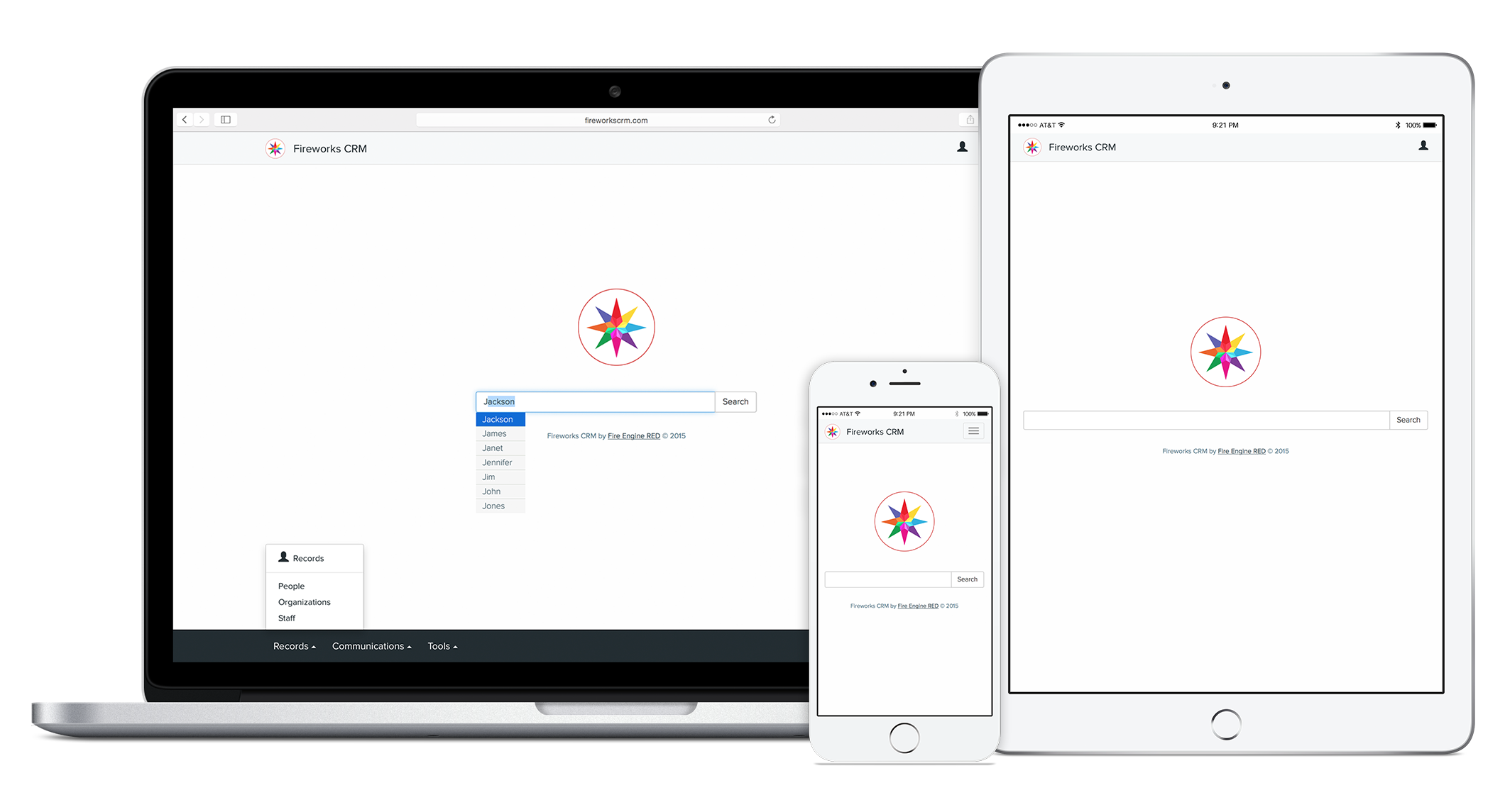
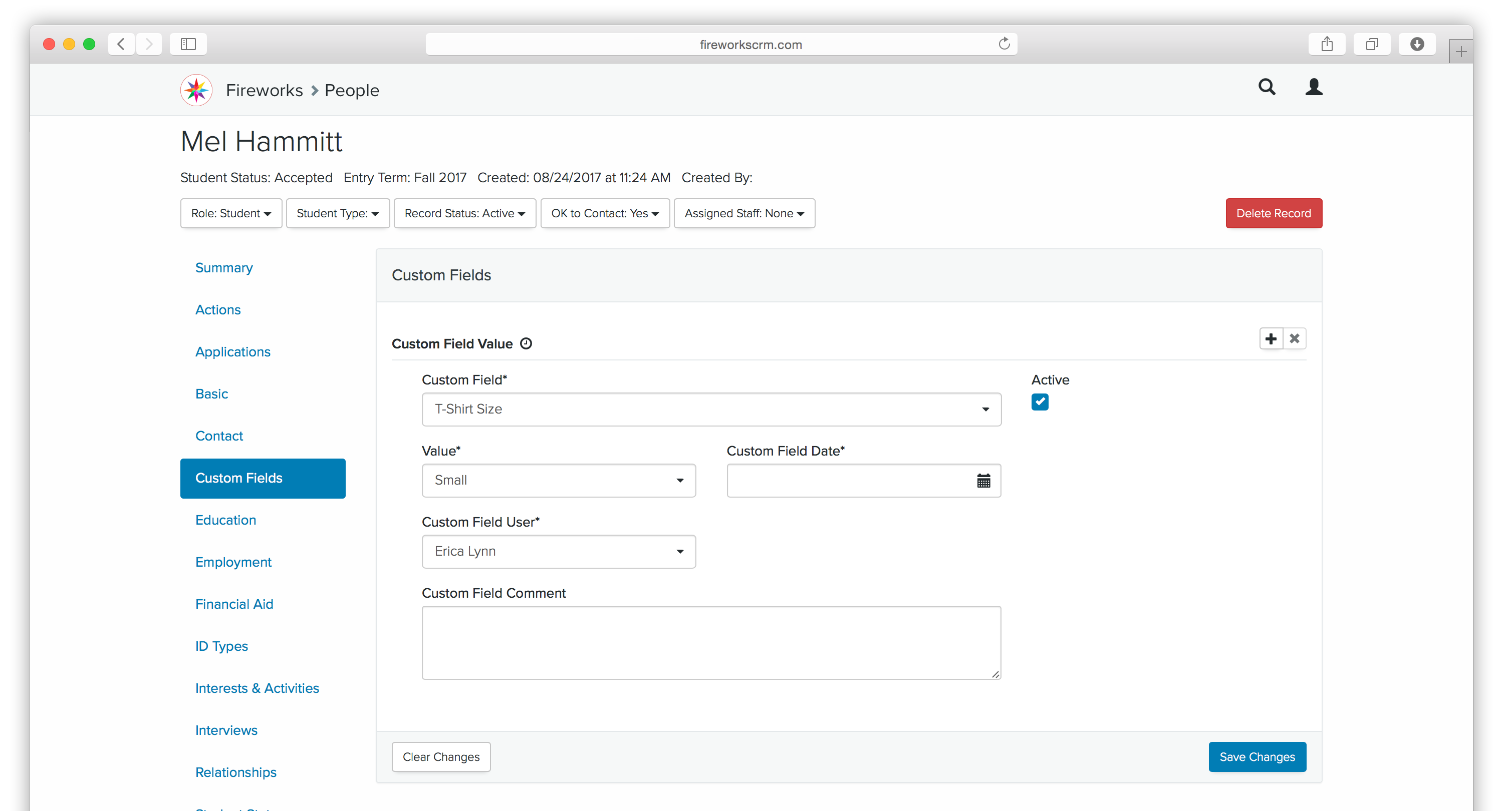
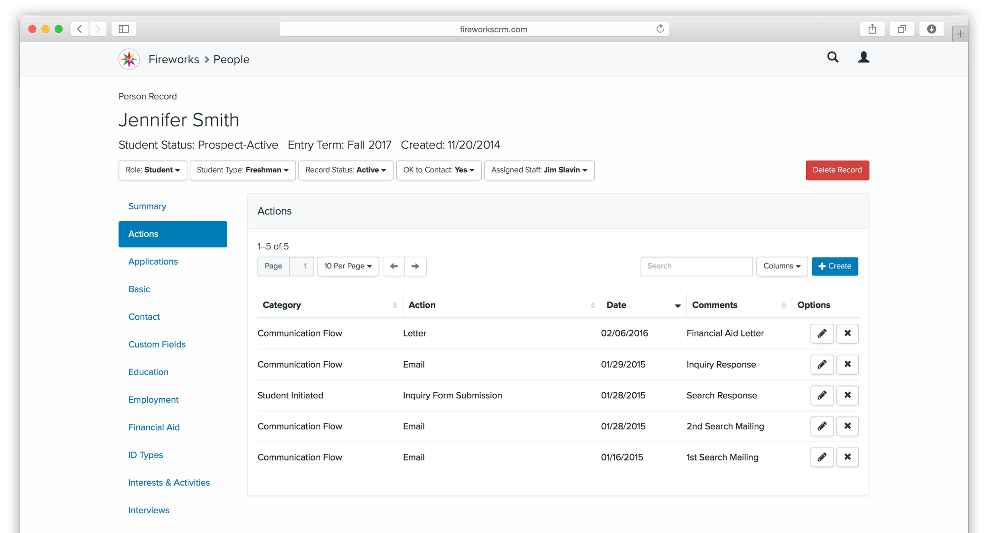
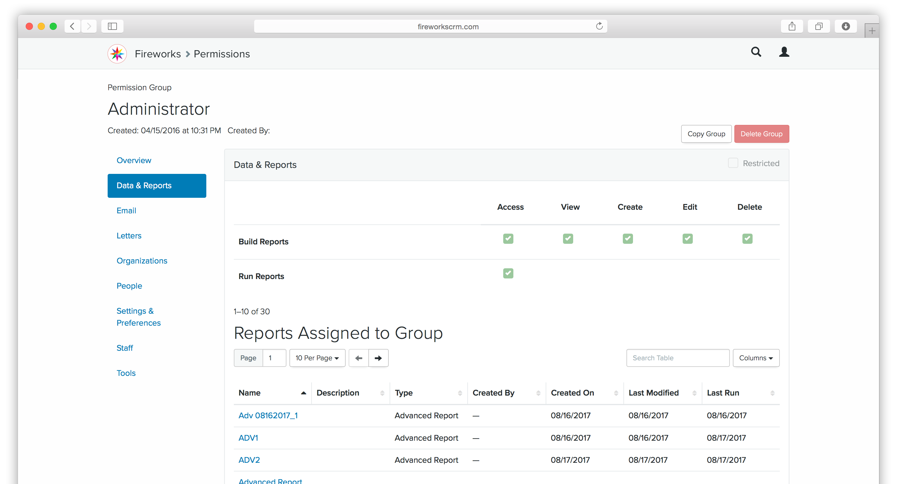
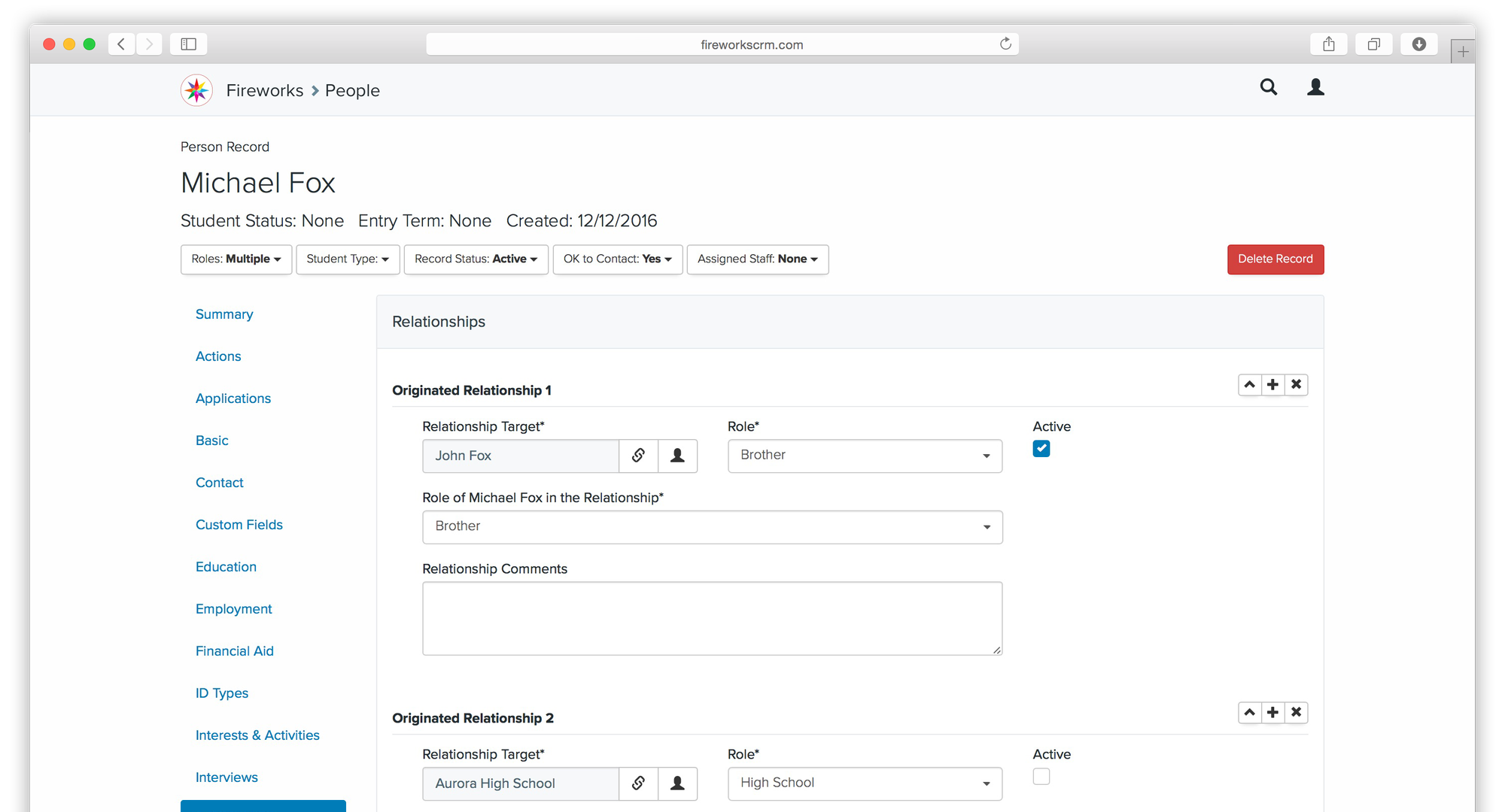
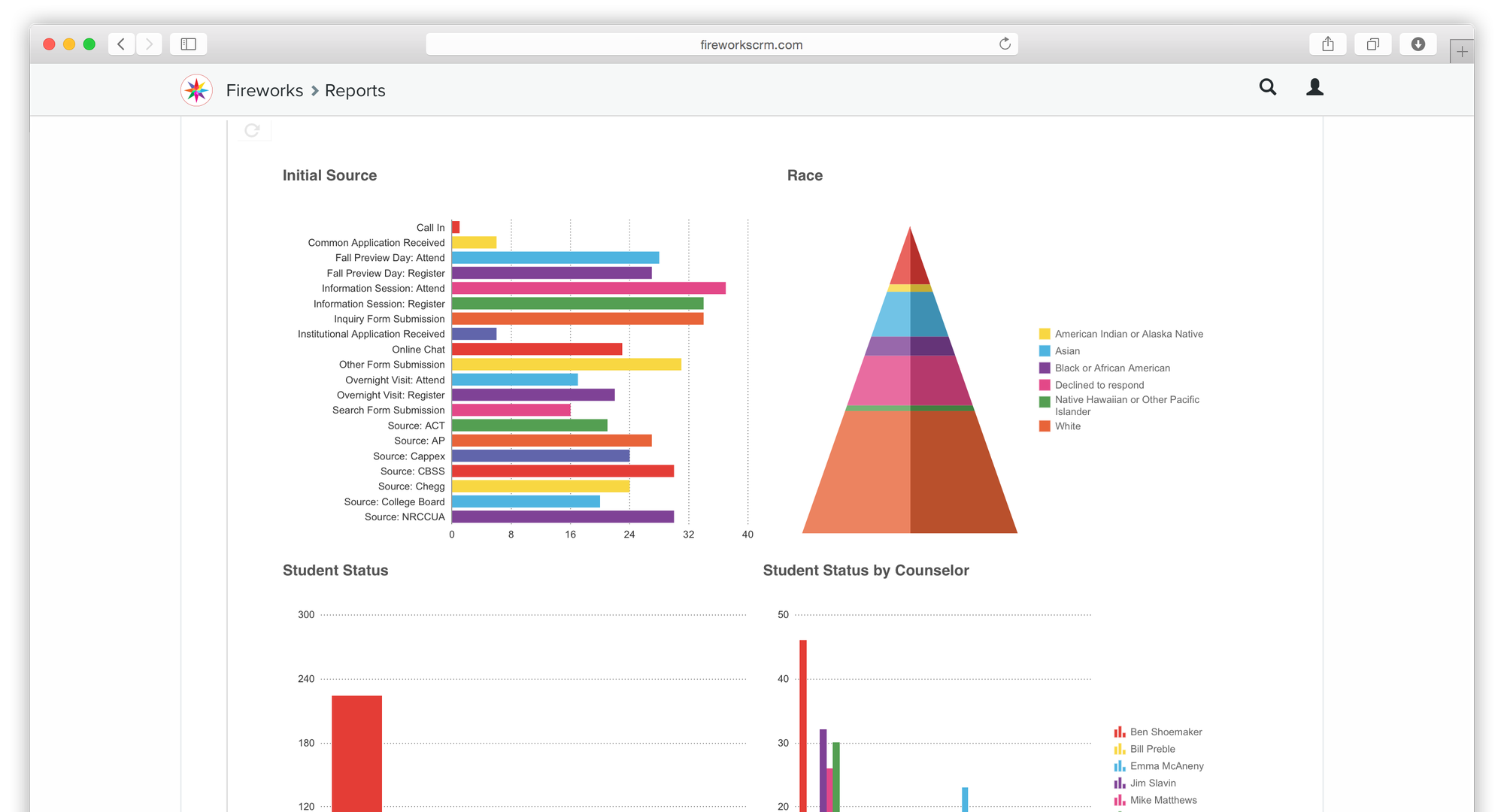
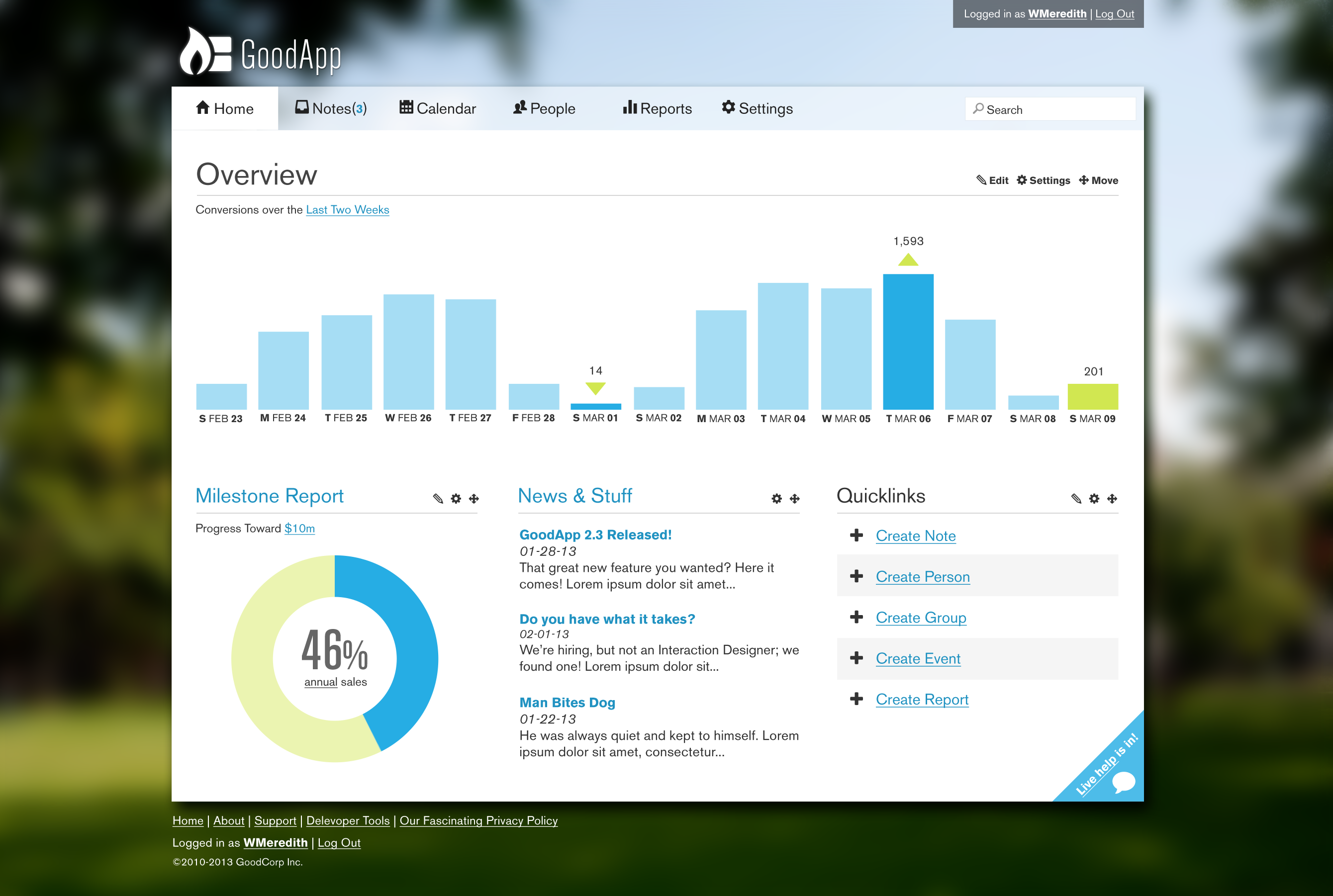
Selected Final Product Screenshots
Launch
After ten months of focused development, Fire Engine RED launched the MVP of its higher education CRM platform to a select group of early adopters for beta testing. The initial response was mostly positive, with users highlighting benefits and giving us valuable feedback about areas for improvement.
Results
The MVP launch validated Fire Engine RED's product concept and allowed the company to invest confidently in further expanding development. The team used the data gathered from early adopters to improve the product roadmap and refine user experiences.
Early Customer Reactions
"Fireworks was not retrofitted from another tech arena... this meant it spoke our language. It was and is a tremendous value."
–Chris Beiswanger, Director of Admissions, University of Colorado Colorado Springs
"Fireworks has saved us hours of time by automating our communication flow... We are now able to devote more time to students and getting results. Our applications were up by 6.6% and our admits were up by 14.6%"
–Mark Meydam, Director, Enrollment Operations and Technology, University of Wisconsin-River Falls
"We chose Fireworks for its intuitive design, easy functionality, and affordable cost."
–Marc Skjervem, Director of Student and Career Advancement Services, University of Wisconsin-River Falls
Conclusion
The internal startup team at Fire Engine RED successfully used an Agile and user-centered design approach to launch an MVP SaaS CRM product that addressed a gap in the higher education marketing services market. Focusing on UX design, user research, and applying WCAG accessibility standards, Fire Engine RED created a highly usable, inclusive product. The MVP's success demonstrated market demand and set the stage for future iterations to refine the product and expand features to serve higher education institutions better.
My Role
2019 - Director of User Experience
2018 - Director of User Experience
2017 - User Experience Lead
2016 - Sr. Interaction Designer
2015 - Interaction Designer
2014 - Interaction Designer
2013 - Interaction Designer
Timeline
Six Years
Skills
- Interaction Design
- User Experience Design
- Design Systems
- Full Stack Development
- Product Design
- Product/User Research
- Process Change Management
- Agile/Lean Project Management
- Technical/Creative Team Leadership
- Recruiting and Onboarding
- WCAG Accessibility
- Branding
Tooling
- LAMP - Linux, Apache, MySQL, PHP (Laravel)
- HTML, CSS (SCSS), Javascript (Handlebars)
- Adobe Creative Suite (XD, Photoshop, Illustrator, InDesign)
- Atlassian Suite (JIRA, Confluence)
- Microsoft O365
- Excel
- Powerpoint
- Google Sheets
- Google Slides
