Product Design Strategy - Building Helpful User Experiences
A practical look at designing software support ecosystems and setting users up for success.
The only 'intuitive' interface is the nipple. After that it’s all learned.
This was purportedly said by Bruce Ediger or Steve Jobs or perhaps someone else… It doesn’t really matter, because it’s nonsense.
Breastfeeding is an (often painfully) taught and learned skill. I strongly suspect that the originator of this design trope had little experience with angry infants or exhausted mothers. If humans need help surviving literally the simplest of tasks… what are the chances they can intuit how to manage their photo sharing preferences in the cloud?
Zero. The chances are zero.
As designers and engineers seeking to empower people through technology, We must build robust systems that enable them to understand and utilize that technology. Otherwise what is the point?
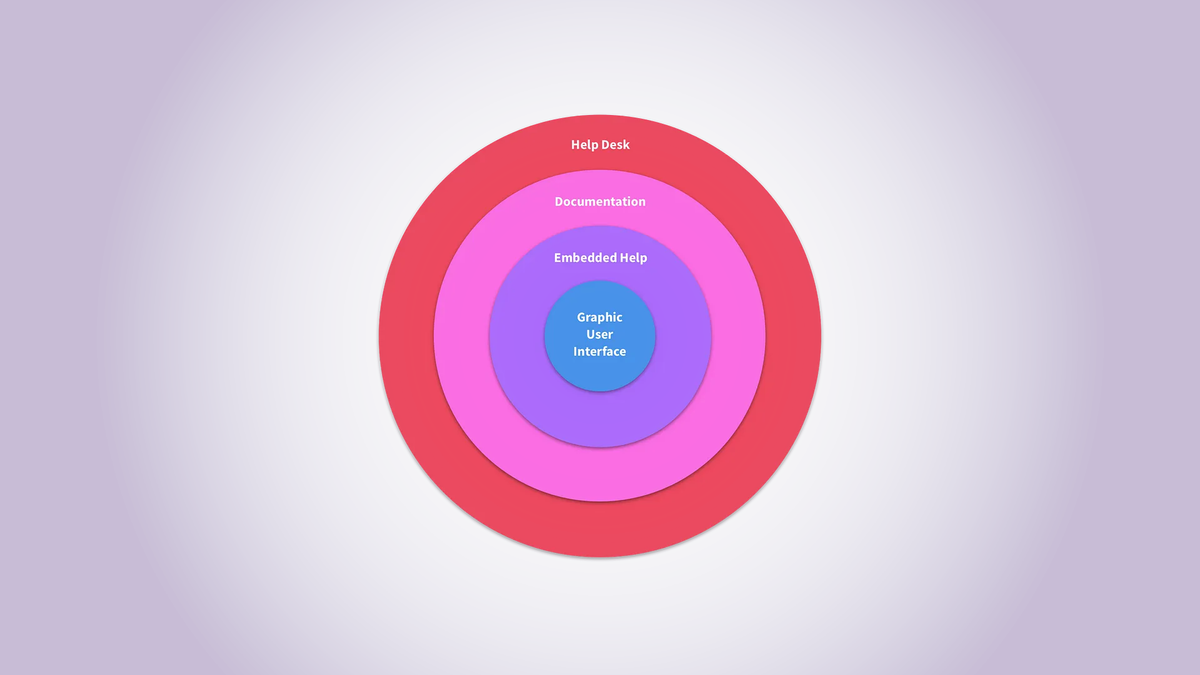
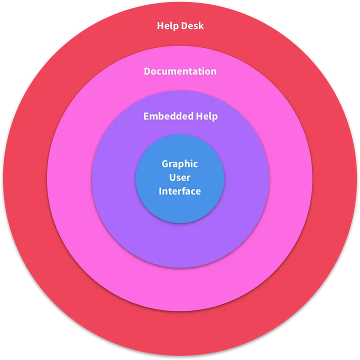
Expanding circles of support — The level of support as well as the cost and complexity increases as we approach the edge of a proposed software support ecosystem.
A System of Support
Users experience many stages of considering, acquiring, questioning and understanding a product. These range from newbies onboarding to seasoned power users digging through complex API documentation. A robust support system should be able to speak to both of these user types and everything in between in a helpful manner.
The above graphic is a conceptual support ecosystem. Let’s break down its parts and see how they might work together. (Our example system is for discussion’s sake. Support systems are as varied in size and complexity as software. The only sure thing is the circle in the center–and even that is assuming we’re not just building a CLI.)
Each level has a corresponding expense and complexity. Generally speaking, the further we move away from the center the more expensive and complex the systems are.
Consideration should be paid to how each type of help relates to the other in the critical task of supporting users as they accomplish their goals. The design of the system in a holistic manner, consistency of language and interaction design, and ease of movement between, layers are what will make it a valuable part of our product, rather than a confusing mish-mash of project artifacts.
Graphic User Interface
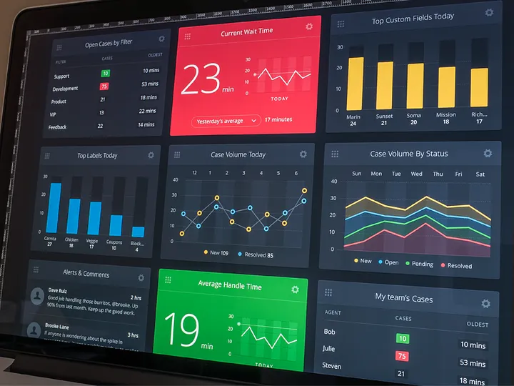
Moving beyond the command line, graphic user interfaces (GUI’s) are the first level of help offered the user in understanding how to access and utilize the functionality our software provides. (In the case of dashboards and business intellegence tools much of the interface may be the functionality the software provides.)
A GUI is itself a collection of affordances or helpful envrionmental cues that reveal to the user how their surroundings may be manipulated. Space and contrast should be effectively utilized to communicate hierarchy and order of function. Color and motion can be used to enhance this hierarchy (but require a disciplined hand to keep from simply distracting). Layouts should guide the eye. Interactive elements like links and buttons should be inviting and responsive.
Perhaps most importantly, direct communication is accomplished in the GUI using signifiers such as written copy and iconography. Elements should be labeled appropriately for our target market. Language and tone should be consistent throughout. Copy should strike a balance between verbosity and terseness. And it goes without saying that copy editing for typos and grammatical errors should be made a priority.
The GUI is ground zero for helping users understand what our software can do for them. Getting that right is job one. It should be inviting and meet expectations set by the branding, marketing, acquisition, training, and onboarding processes.
It’s worth addressing here the persistent myth I’ve encountered in my career that if we do this GUI part well enough, we can forget all the other stuff. I think this is nonsense when it comes to software of any sort of power and complexity. And I think it has persisted because it would be so nice if it were true…
The kernel of truth is that the GUI is just part of the bigger help system. More heavy lifting by the GUI means other areas can probably do less, but balance is important. An interface that explains everything all the time will be cluttered and annoying. It will not be appealing during sales and marketing and power users will hate it. Conversely, an interface that is too sparse may demo well and appeal to power users, but have a learning curve that makes getting new users up to speed an impossibility. This is why it’s important to look at the user experience of our software help system holistically.

Embedded Help
Here we have the first humbling admonition that we may not actually be able to design software that anyone can pick up and use–embedded help. The most popular form of this at the moment seems to be the onboarding dialogue or splash screen. As shown in the graphic above, this is usually a short introductory set of images, GIFs, or videos may walk a first time user through the basics of the application.
Embedded help also often takes the form of GUI augmentation such as an overlay with helpful notes or tooltips. These are often hidden but can be triggered automatically when a user first encounters an interface or perhaps on demand if they turn on a “help mode”. Or perhaps help mode is enabled by default and a user can turn it off.
Building and maintaining something like this needn’t require going too far above and beyond the level of effort needed to create our GUI in the first place. There is the design and copy to consider, but embedded help is likely contained in the same technology stack as our GUI and can be built and released using the same processes and resources since it is an extension of existing elements.
Documentation
People who make software love documentation! Just kidding; no one likes documentation. Except users. They really really like it, if it’s done right.
The problem with documentation is now we’re definitely moving to the outside of our circle of support graphic. Things are getting harder and more expensive.
Challenges to helpful documentation are rife and well known.
- It needs to be written by someone who understands the software.
- It needs to be written by someone who understands the market.
- But perhaps most confounding: Documentation needs to be written in a manner that is engaging, but technically accurate and helpful and not patronizing.
Bless the software companies with well written documentation. They are few.
Let’s say we do make the investment in time, money, and resources and get our docs in a good spot. The good news is great documentation can be beneficial in different ways, so we reap our investment over and over.
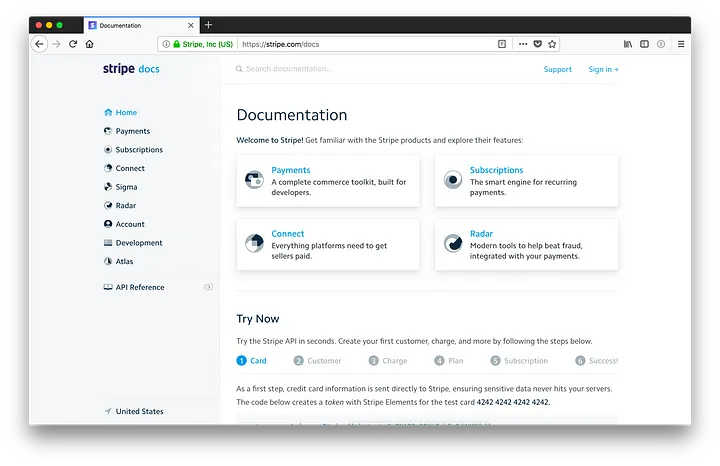
Firstly, we should link to our help docs from within the application itself. The best way to do this would be contextually appropriate deep links directly to the helpful topics. This could come in the form of “Would you like to know more?” links at the end of our embedded tooltips. Or perhaps a suggested reading link on error pages that is specific to the error type or a documentation search box embedded on more general errors.
Documentation can also be written with an eye toward training and on-boarding. Pieces of documentation could be reused to create our splash screens or in hands-on training sessions with little modification.
Good software documentation can also be the star of content marketing campaigns and sales pitches. Leveraging a robust documentation site for SEO purposes is a slam dunk from a topical content standpoint. Good docs should be speaking directly to how to solve the market’s problems on every page.
Help Desk
This is a big topic that I am only going to touch on tangentially. And by that I mean I’ll only speak about help desk support in the ways that it touches and influences our bigger software support system. The nuance and logistics of the support itself is far beyond the scope of this article.
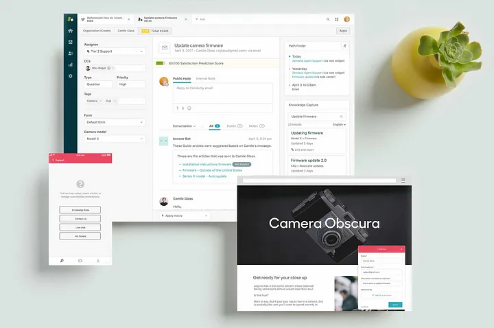
So the final tier of our circle is without a doubt the most complex and most expensive as it involves real people talking to each other. This requires hiring, training, staff, facilities, communication logistics, and more. (Or at the very least outsourcing all of the above–its own subtle art to get right.) But how do we incorporate it into our existing structure so that users can move between the tiers?
In our exemplary support structure users are to submit help desk tickets into a queue via a form and have client support representatives respond to them in turn. Where are the entry points into this tier of support?
One entry point could be on any error pages within our software. This could be as simple as a link or as robust as an embedded form within the page itself. This should have no problem living alongside helpful error messaging copy, any links to relevant documentation, or a documentation search form.
Another help desk promotion point could be on the home page of our marketing website. If my company sells a piece of software, there is likely a marketing site for that software. That site’s support and contact pages are also appropriate places to have links for contacting the help desk.
Lastly, let’s say we’re really proud of our support and have invested significant resources there. Perhaps it’s a competitive advantage and we want users to be able to jump straight to it whenever possible. We could add a subtle corner stripe to our software during business hours that says “Support is in!” with a link to a dedicated help desk page. (Note: this could be annoying for power users. Make sure to offer a way to dismiss it.)
Things Left Unsaid (Quite a Bit)
There are all kinds of support options that I didn’t even mention like chat bots, chat humans, webinars, service status pages, social media channels, and more. The service support industry is huge and each software product in each market will be deserving of some mix of support systems that work together in harmony to help the user empower themselves with software.
Final Word
We as designers and engineers must be wary of the ego trap that we can build or design software that is so grand, so useful, so good that humans will be able to use it without help. Dropping something on the user without introduction or explanation for a variety of understandings is a recipe for disaster or worse: a recipe for nothing at all.
Most users that cannot figure out our software will not tell us; they just won’t use it. They will think it is broken. They will think it is bad. They will not empower themselves with the technology we’ve worked so hard to provide. Not without help.
This piece was last updated October, 2024. It was originally published by Wade Meredith on Medium in March, 2018.
